A pie chart is a circular chart divided into sectors, illustrating numerical proportion. In a pie chart, the arc length of each sector (and consequently its central angle and area), is proportional to the quantity it represents. Pie charts are widely used in the business world and mass media.
Sample task
You should spend about 20 minutes on this task.
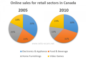
The two pie charts below show the online shopping sales for retail sectors in Canada in 2005 and 2010.
Summarise the information by selecting and reporting the main features, and make comparisons where relevant.
Write at least 150 words.
Model answer
The two pie charts compare the percentages of online sales across different retail sectors in Canada in the years 2005 and 2010. For three of the sectors, it is evident that over this time frame there was significant change in their proportion of online transactions.
At 35% we can see that electronics and appliance sector accounted for the majority of online sales in 2005, but this percentage had dropped to 30% by 2010. During the same five-year period, as an increasing number of people chose to purchase food and beverage online, we can see that transactions went from just 22% to 32%, making it the retail sector with the largest overall proportion of the online market.
In 2005, the home furnishing industry boasted an impressive 25% of the total online sales in Canada. However, by 2010, the figure had fallen considerably to 15%. Interestingly, online sales of video games eventually overtook sales of home furnishings, although video games still represented only 23% of the market.