Line graphs can be used to show how information or data change over time. They have an x-axis (horizontal) and y-axis (vertical). Usually the x-axis shows the time period and the y-axis shows what is being measured. Line graphs can be used when you are plotting data that have peaks (ups) and troughs (downs). In other words, they highlight trends.
Plan
- Description of what the graph illustrates.
- An overview.
Brief summary of what happens on the graph.
- Details, less noticeable features.
Where did the graph rise/decline sharply and where slowly? What is the difference between initial and final figures?
- Summary, comparison.
Verbs of movement
Going up ↑
To rise, to go up, to increase, to grow, to climb
Dramatically: to shoot up, to surge, to rocket, to soar
Highest point: to reach a peak, to peak, to reach the highest level
Going Down↓
To decrease, to fall, to decline, to go down
Dramatically: to drop, to plunge, to plummet, to slump
Lowest point: to fall to a low, to sink to a trough, to reach a bottom, to hit a low
No Change ─
to remain constant/steady/unchanged/stable, to stabilize, to level off
Up and Down ↑↓
To fluctuate, to undulate, to be erratic
to dip
Adverbs
A little: gently/slightly
steadily/gradually
suddenly
A lot: sharply/dramatically/steeply
Expressions of Time
• in 2015/ recent years
• over the year/ period
• between 1970 and 2018
• from 2000 until 2018
• since (point of time) May/ 2011
• for (period of time) the period / five months
Nouns of movement
Going up ↑
A rise, an increase, a growth, a climb
Dramatic: a surge
Highest point: a peak, the highest level, a high
Going Down↓
a decrease, a fall, a decline
Dramatic: a drop, a plunge
No Change ─
stabilization
Up and Down ↑↓
Fluctuation, undulation
a dip
Note! We cannot make nouns from some verbs, such as to rocket, to plummet, to level off etc.
Examples
The average income level rose from $800 to $1000/ There was a rise in the average income of $200.
Sales fell to 25 million dollars in 1998/ there was a fall in sales of 25 million dollars in 1998.
Sales fell by 2%/ there was a slight fall in sales of 2%.
It peaked at 40%/ it reached a peak of 40%.
It fluctuated between 10 and 13 percent, there was a fluctuation of 3%.
Introduction
The graph shows /indicates/depicts/illustrates/outlines/compares…
From the graph it is clear…
It can be seen from the graph…
As can be seen from the graph,…
As is shown / illustrated by the graph,…
E.g. The graph shows the percentage of school graduates entering universities in England over 10 years.
Comparison of graphs
The first one illustrates…, whereas/while the second one shows…
The number of … correlates with…
Useful verbs: to surpass, to exceed
Note!
You can use a combination of adjective + noun, or verb + adverb, to avoid repeating the same phrase.
Example: There was a sharp decrease in the numbers. The numbers decreased sharply.
Exercises
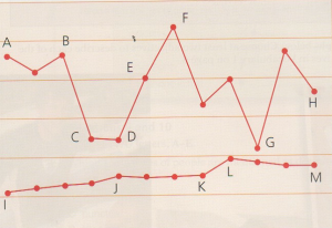
1. Match the parts of the graph 1-10 with the verbs a-j
|
1. A-B |
a) Hit a low |
|
2. B-C |
b) Fell and then leveled off |
|
3. B-D |
c) Remained flat/stable |
|
4. D-F |
d) Plummeted |
|
5. F |
e) Rose gradually |
|
6. F-H |
f) Fell gradually |
|
7. G |
g) Soared |
|
8. I-J |
h) Dipped |
|
9. J-K |
i) Fluctuated |
|
10. L-M |
j) Hit a peak |
2. Replace the underlined words with synonyms (+ paraphrase using verbs or nouns respectively)
Example: There was a gradual decline in profits. – There was a steady fall/decrease in profits. The profits declined/fell/decreased gradually/steadily.
1) Laptop purchases soared over the period.
2) The sales dropped in June followed by a a period of stability.
3) The number of followers reached a peak in 2018.
4) The number of complaints gently fell and then quickly recovered.
5) The amount of money saved steadily increased over the year.
6) Attendance at the lectures remained stable.
7) The market share rose dramatically.
8) The population dipped.
9) Customer number fluctuated.
10) There was a surge in sales.
3. Make nouns out of these verbs
1) To rise, 2) to increase, 3) to dip, 4) to surge, 5) to fluctuate, 6) to decline, 7) to peak, 8) to stabilize, 9) to plunge, 10) to drop
4. Study the sample task and answer
The line graphs below show the production and demand for steel in million tonnes and the number of workers employed in the steel industry in the UK in 2010.
Summarize the information by selecting and reporting the main features, and make comparisons where relevant.
You should write at least 150 words.
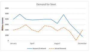
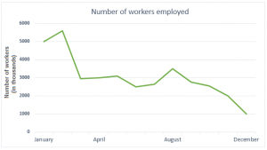
The first line graph compares the steel production and the demand in the UK in 2010 while the second one reveals the employee number in the industry in the same year. Overall, the production of steel was higher throughout the year than that of the demand except in December and the highest number of employees was employed in this industry at the beginning of the year.
According to the first graph, the UK produced 4000 million tonnes steel in January 2010 and at that time the demand was exactly half of that. After the first quarter, the production and needs for steel remained almost the same. At the end of the second quarter, August, the UK’s steel production stood at just over 3 thousand million tonnes against a million tonnes less demand. From January to November, the production was higher than the demand and the gap between these two was on average a million tonne. However, the scenario shifted dramatically at the end of the year. From September to November, the steel production plummeted and so did the demand. In December, the demand for steel exceeded the total production.
The second line graph reveals that 5 million employees worked in the steel industry and this number dropped to two million less in April. From that time onward, the employee number showed some fluctuations and in August, the UK steel sector employed around 3.5 million workers. This number continuously dropped throughout the rest of the year and declined to 1 million in December.
a) Complete another description of the same graphs
Correlated, higher, remained, dropped, dramatically fell, end, stood, declining, double, outlines
The line graph 1) … the production and demand for steel in million tonnes in the UK in 2010 and the number of workers employed in this sector. Generally speaking, the production of steel in the UK was 2) … than the demand and the number of workers in this sector directly affected the production capability.
At the beginning of 2010, the demand for steel was 4000 million tonnes which was 3)… than the actual demand. The steel production and demand in April 4)… almost the same in April. In August, at the end of the third quarter, the demand remained unchanged but the production 5)… to just over 3000 million tonnes. The demand 6)… in November and at the end of the year, the demand went higher than the production. During this time the demand for steel was 2000 million tonnes against less than 1000 million tonnes production.
The production of steel is 7)… with the employed workers in this sector. In January 2010, the steel industry in the UK employed 5 million workers and it went as high as roughly 5.8 million in February. From March to July, the workers’ number 8)… at an average 2 million and kept on 9)… from September till December. At the 10)… of the year, the UK steel sector employed 1 million people.
b) Complete on more description of the same graphs
falling, fluctuations, shows, surpassed, rise, reached, rose, presents, reducing, soaring
The first line graph 1)… a comparative analysis of the market requirement for steel and production of this material in 2010 in the UK. The second graph 2)… the total number of workers employed in this industry in the same year. Overall, the steel production in the UK in 2010 3)… the demand, except at the end of the year.
The production of steel throughout the time exceeded the demand. In the first quarter of the year, the actual market call for steel started at 2000 million tonnes in January, but production was two times with a continuous 4)… . Later somewhere in April, the demand started 5)…, but production was 6)… and 7)… 5000 million tonnes. Moreover, demand showed further 8)… approximately till November and fell to almost zero whereas production of the steel attained plateau for some time with further variations and started 9)… later. After that, in December the demand was nearly two times higher than the production.
From the second graph, it is evident that the total number of workers in the steel industry in the UK was 5000,000 in January and it 10)… for a month or so. But it then showed a sudden plunge and reached 3000,000 by April, with further fluctuations in number till August. However, the number of workers continued to fall and reached 1000,000 by the end of the year.
Find more samples here: https://www.ielts-exam.net/IELTS-Writing-Samples/Line-Graph.html