A bar chart or bar graph is a chart that uses horizontal or vertical bars to show comparisons among categories. One axis of the chart shows the specific categories being compared, and the other axis represents a discrete value. Some bar graphs present bars clustered in groups of more than one (grouped bar graphs), and others show the bars divided into subparts to show cumulate effect (stacked bar graphs).
Plan
1. Introduction
1 or 2 sentences, where you paraphrase the information from your question.
- what your graph shows
- for what period of time
2. General Overview
Description of major trends on the graph – 2-4 key features.
Use word ‘overall’ to start your general overview.
3. Specific details
Description of specific features in 2 or 3 paragraphs.
4. Summary, comparison.
Tips:
- When analyzing a bar-chart, we cannot always give exact details (due to inaccuracies of the chart), so use words around, about and approximately when giving inexact data.
- Give data for each year shown on the chart.
Sample Task
You should spend about 20 minutes on this task.
The bar chart shows the monthly spending in dollars of a family in the USA on three items in 2010.
Summarize the information by selecting and reporting the main features and make comparisons where relevant.
Write at least 150 words.
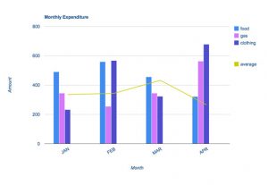
The bar chart depicts the monthly expenditure on food, gas and clothing of a family living in the USA in 2010. Overall, it can be seen that levels of expenditure fluctuated over the period.
To begin, in January the most money was spent on food, at approximately $500 per month. Although expenditure on food increased slightly the following month, it then fell to account for the lowest expenditure of all the items at the end of the period at just over $300.
Gas appeared to follow the opposite pattern to food spending. It started lower at about $350 per month, falling in the following month, and then increasing significantly to finish at just under $600 in April.
Clothing, which at just over $200 accounted for the lowest expenditure at the beginning of the period, fluctuated dramatically over the time frame. After reaching around the same levels as food in February (nearly $600), it dropped markedly in March, then jumped to just under $700 in the final month.
With the exception of an increase in March, average spending decreased slightly over the four months.